
Flow design: media section
The Media section controls how each piece of content (media) appears inside your Flow — including its style, layout, and how visitors interact with it.
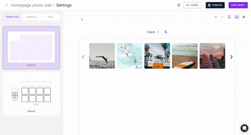
Access the media section
Go to Flow Settings → Layout → Media in the left-hand menu.
You’ll find two main tabs: Standard and Customize.
Style
The Standard tab lets you choose the main format for your media:
- Classic – square (1:1) layout, great for traditional social feeds.
- Trendy – vertical format, perfect for mobile experiences.
- Bubble – circular layout, similar to Instagram Stories.
In the Customize tab, you can fine-tune your media’s appearance by adjusting:
- Corner radius
- Aspect ratio
- Visual effects like shadows and borders
Display & content
These two options work together to define how and what content appears on each media item.
Display
Choose how your content is presented — for example:
- Minimalistic – clean and simple
- Standout – highlights key details with overlays or icons
- Details - highlight key information below the media
- Capsule - display information in a capsule within the media container
- None - hides all information. Displays media only.
Content types
Select what information appears on your media:
- Essential – shows most common media info, such as creator username, post type (video/image), and first product name
- Social – shows social related info, like social icons, likes, and platform logos.
- Product – highlights product information: name, price, image…
- Button – adds a custom CTA button.
In the Customize tab, decide what content appears:
- At rest (default view)
- On hover (when visitors move the cursor over the media)
Status: Be aware that the available content options will change depending on the content type you choose - essential, social, product or button.
You can also tweak:
- Text size and color
- Hover effects:
- Zoom in – enlarges the selected media
- Shadow – adds depth with a shadow effect
- Overlay – applies a semi-transparent layer
Interaction and behavior
Define how visitors interact with your media and how videos play.
Choose what happens when your Flow includes multiple videos in the videos auto-play field:
- Sequentially – one after another
- Simultaneously – all play at once
- On hover – plays only when hovered
- Never – disables auto-play
Decide what happens when someone clicks a media item in the click behavior dropdown field:
- Open post – opens the content in a pop-up (Post section)
- Redirect to 1st product page – sends visitors to the first linked product page.
- Open social post – opens the original post on its social platform
- None – disables click interaction

Continue customizing your Flow with these guides:
- Customize the main structure of your Flow
- Design your post pop-up window
- Filter and sort content in your Flow
- Embed your Flow on your website