
Style settings for your Flow - themes
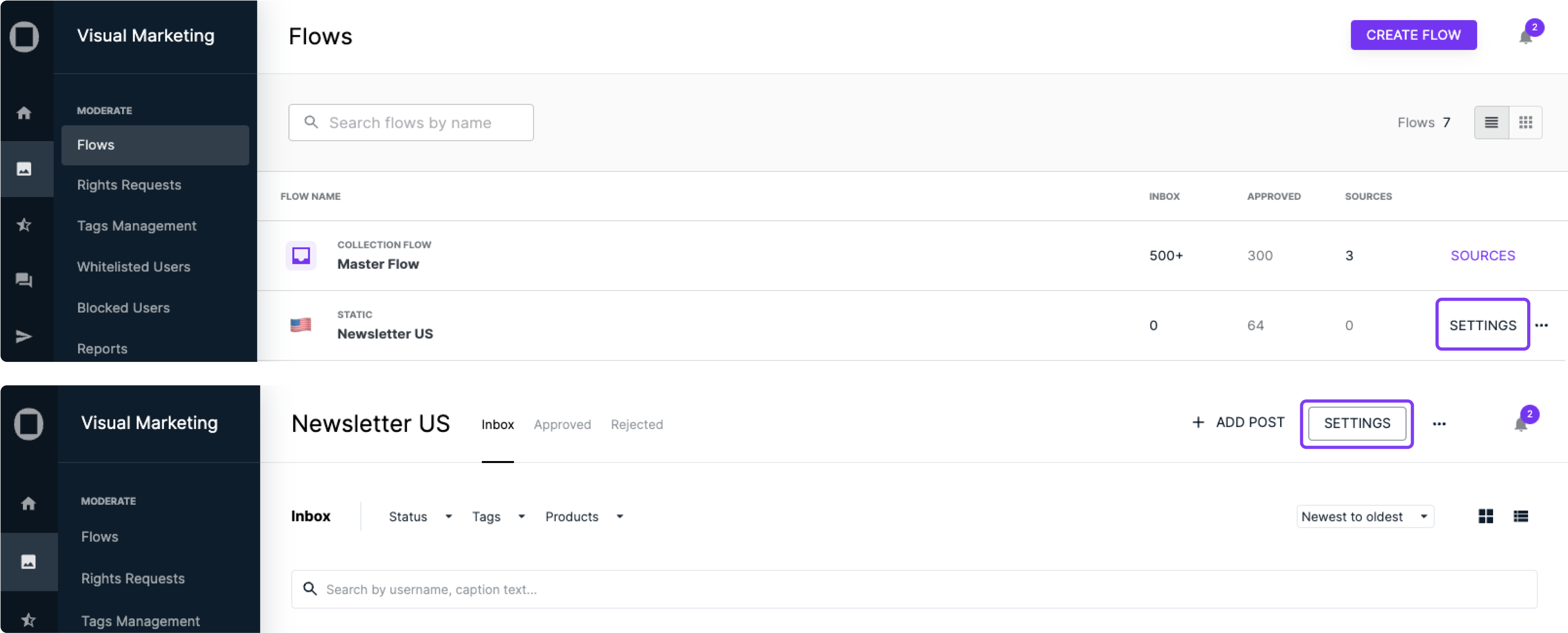
To access the settings for your Flows, click on ‘Settings’ directly from the Flows page or use the top-right button within each Flow.
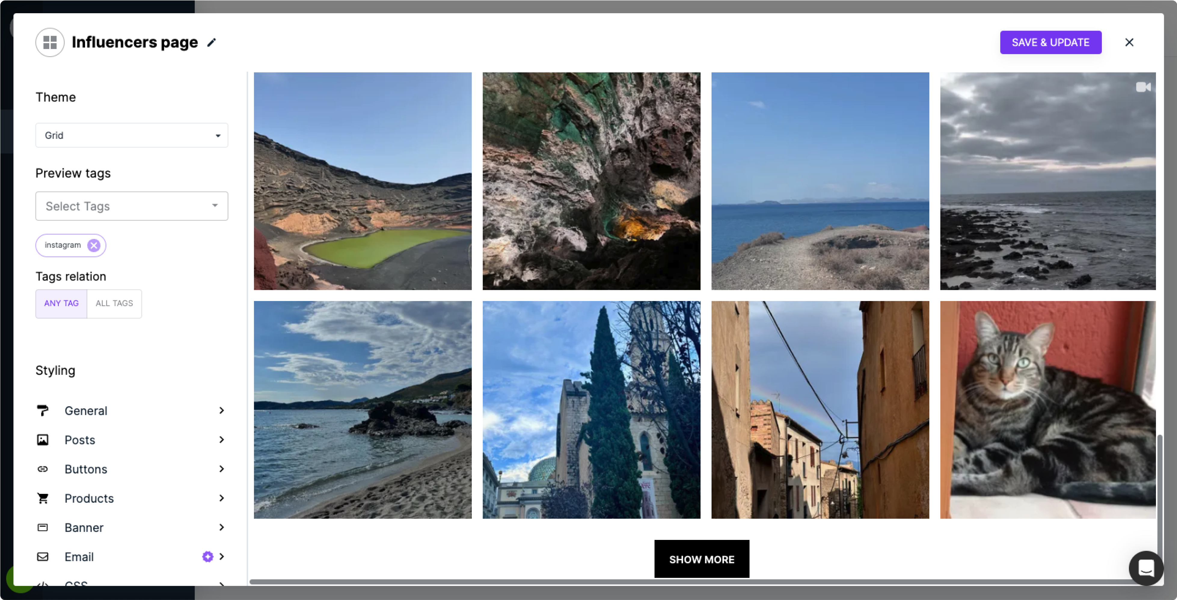
When you select this option, a popup box will appear, allowing you to instantly see the changes you’re making.
Note: For Dynamic Tags or Product Flows, which retrieve content based on tags or productID properties, you’ll need to select an example to preview your modifications.
Important:
We no longer allow embedding the "Master Flow", as they could display any of your approved content.
However, if you’ve previously embedded it and need to update the settings, simply click on the Flow, open the three-dot (meatball) menu, and select ‘Settings’.
Understanding the menu
Flowbox offers a variety of style and theme settings to make it easy to customize your Flows.
- The first option is your theme:
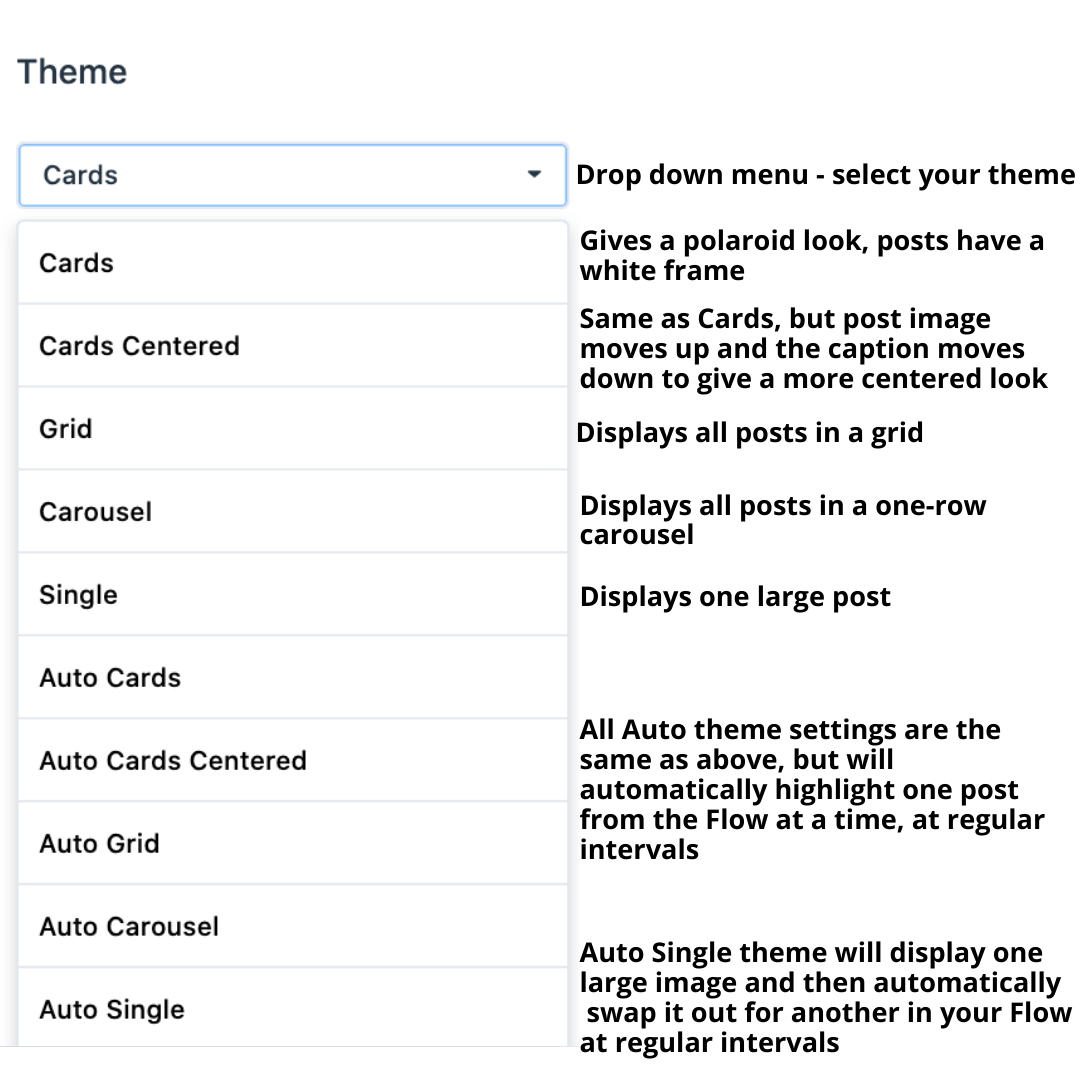
Theme examples
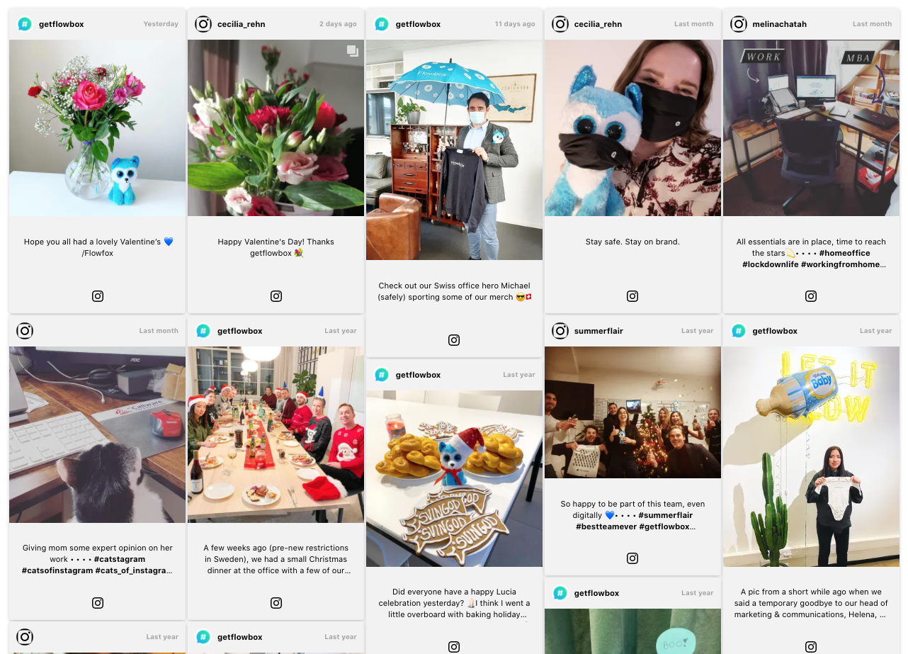
Grid
Displays all posts in a grid. You can customise the number of rows and columns. This is an ideal Flow design for a homepage or an Inspiration page.

Cards
This theme gives a polaroid look, framing your posts and displaying information underneath.
Cards centred
Same as Cards, but the post image moves up and the caption moves down to give a more centred look.
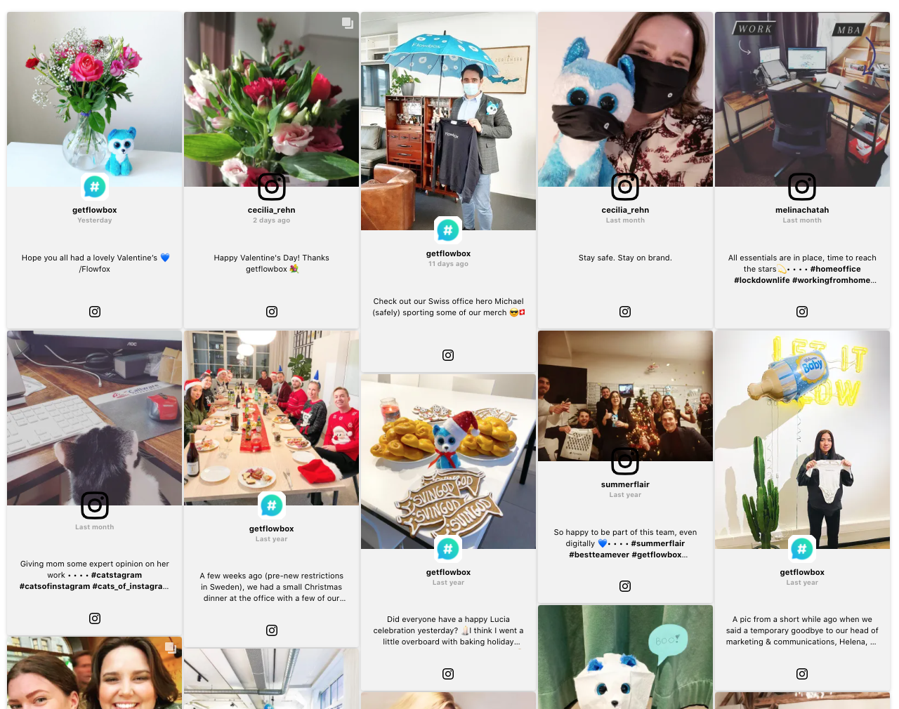
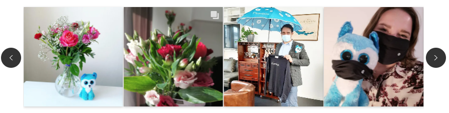
Carousel
Displays up to 29 posts in a one-row carousel. This Flow theme works well on a Product page, to incorporate user-generated content alongside product images.
Auto themes
All Auto theme settings are the same as above, but will automatically highlight one post from the Flow at a time, at regular intervals.
The Auto themes work very well on large screens, displayed at conferences, events, or inside stores. See some examples of physical Flow displays here.
- Once you've chosen your theme, you can customise your Flow further:
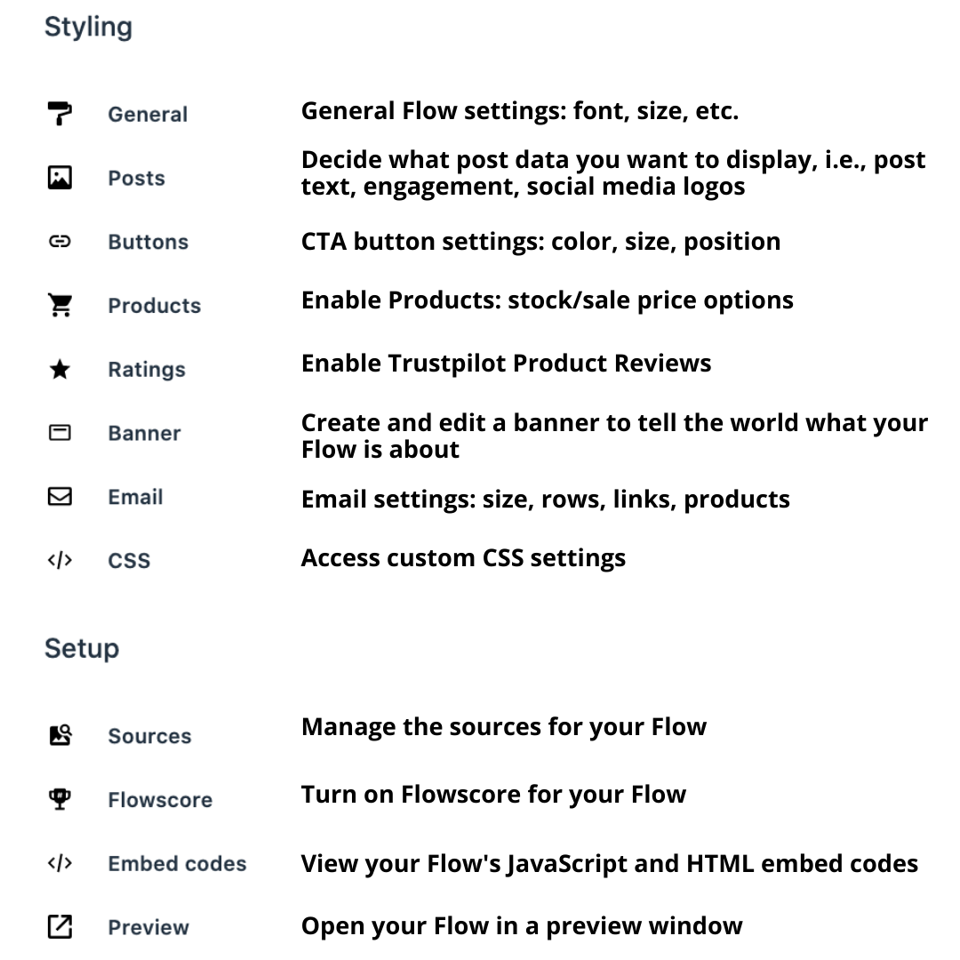
To see the full options of each style setting, for each theme, check out this article.